

15
February 2018
What’s the difference between UX and UI design?
First off, let’s answer the question: What exactly are UI design and UX design, and what is the difference between the two?
Simply put, UI is how things look, UX is how things work. UX is a process, while UI is a deliverable. Let’s elaborate further!

User Interface Design
User Interface (UI) design is a large field. In theory, UI is a combination of content (documents, texts, images, videos, etc), form (buttons, labels, text fields, check boxes, drop-down lists, graphic design, etc), and behavior (what happens if I click/drag/type).
It takes a good eye, a lot of practice, and a lot of trial and error to get better at it. As a UI designer, your goal is to create a user interface that is engaging, beautiful, and also creates an emotional response from the user to make your products more lovable and beautiful.
Design isn’t all about learning to use design software —although that’s certainly important. Software is like a designer’s sword. You need the sword to fight the battle, but that’s not all you need to learn to use. You need to learn the strategies, processes, tricks and tips of the fight/game to be able to win it. In UI design, you need to brainstorm, experiment, test, and understand your users and their journey throughout using your product.
The benefits of having a well-designed product is that you’ll have a higher user retention rate.
Things to remember about creating delightful UI
1. On a screen, people will always read the biggest, the boldest, and the brightest first
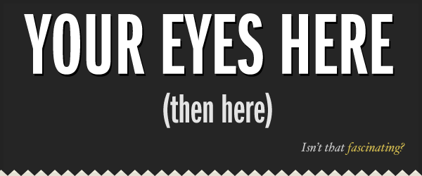
This is human nature. Our attention is programmed in such a way where we see the biggest, the boldest, and the brightest first. And then it moves to smaller, less bold, and less bright things.
As a designer, you can use this information to curate the experience of your user.
2. The Importance of Alignment
Alignment is a fundamental aspect of UI Design. And an important design principle is: minimize the number of alignment lines. It improves readibility and makes the design more pleasing to the eye.
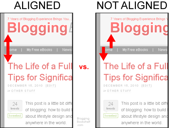
In the images above, the image on the left has 1 alignment line. While the image on the right part has 4 alignment lines.
3. Become an attention architect
Here’s two ways to interpret this:
- You need to grab the user’s attention with your design.
- You need to pay attention to every little thing in your designs.
To be a great designer, you need to do both. The latter lets you achieve the former.
UI Design is about tailoring the experience for your users by guiding their attention towards different important things.
Ways to use text to grab user’s attention:
- Make its size larger or smaller.
- Bolder or brighter in color. Or make it muted.
- Use a typeface with a heavy weighting versus something that is thin or light.
- Italicize words. Capitalise or lowercase some words.
- Increase the distance between each of the letters to make the overall size of the words take up more space.
The most important thing when designing is testing! Make sure you try out different everything: colors, fonts, tones, angles, alignment, layout, etc. Experiment with different designs so that you can architect a user journey using various ways of commanding attention.
User Experience Design
User Experience (UX) design is about creating pain-free and enjoyable experiences.
Here are 7 questions to ask yourself to know if the UX of your product is good:
- Usability: What is the user using my app for? What is the core functionality of my app? What is it that I need to get right in order for my app to be used?
Now how can I minimise the number of steps that it takes for the user to achieve it within my app? What is the main thing my users want to achieve with my app? How can I make the experience of achieving that as smooth, quick, and enjoyable as much? - User Profiling: You have to know who your users are and what they want to achieve using your app. The best way to do this is by profiling your users.
You have to do a few thinking exercises to understand your market. Narrow down your target/user audience.
The main question to keep asking yourself is: What is the core functionality of my app? Profile your users to continually reevaluate that question. - Asking for permissions: If your mobile app has push notifications, needs location services, integration with social media, email, etc, you know you need user’s permission on an alert message that pops up on the screen when they’re using your app. Instead of asking all at once which would overwhelm the user, use The Benjamin Franklin effect. Before asking someone for a big favour, ask them for a small favour. And slowly nudge the user towards a certain direction.
Make sure your app sends the permission notification only when the user is about to use that feature and not when they just launch the app. - Form vs Function: Design is not always about the form — beautiful color scheme, the fonts, the layout, and such. It’s also about the functionality. Always go for function over form.
- Consistency: Am I being consistent throughout my app? Is my app consistent with my brand? Inconsistency in design creates confusion. A confused user is an unhappy user.
Think of consistency, not just in terms of appearance, but also in terms of functionality. - Simplicity: Can I make it simpler?
Make sure your app is grandma-proof, i.e., older people can understand it and use it.
A bad confusing app would be rows upon rows of buttons, lots of different colors, and a tightly packed user interface. - Don’t make me think: Am I making things difficult for my user?
Humans don’t like to be confused.
When we’re programming, we’re trying to make our code as lightweight and as efficient as possible.
When we’re designing, we’re trying to make the interface as clear and as least confusing as possible. And beautiful!
Try to make your wording as clear as possible.
Points to note for a great UX:
- Don’t have long tutorials at app launch explaining how to use the app. Instead you want to give your users tidbits of information as and when it’s needed. Make it contextual. Give tips and hints. Try to build design where the user figures out the app within a few seconds without needing an explicit tutorial. That’s where intuitive design principles come!
- When something is so ingrained in mobile users’ minds such as pull to refresh, or pinch to zoom — stick to those rules for your app. And do NOT use those actions for some other goal. Like pull to add a new journal entry, it gets super confusing. A journal app I was using did that and it was confusing.
- Don’t treat your users like idiot boxes. Don’t give a popup/alert to the user to confirm a frequent action. Ask for confirmation only for harmful actions users might regret — like deleting something, or making a purchase.
Unnecessary popups and alerts interrupt the flow and result in a bad user experience. Do not make your customers feel stupid.
Source: https://medium.freecodecamp.org/whats-the-difference-between-ux-and-ui-design-2ca8d107de14